Doubled online mortgage application rate at a fintech startup
- >2x pre-approval submissions
- 38.8% sign-up conversion (from 13.8% over 4 mos)
- 93/100 mobile PageSpeed (from 59)

Overview
As the first designer at a small startup, my mandate was to evolve their validated mortgage pre-qualification MVP into a comprehensive companion app to the whole home-buying experience.
I owned the end-to-end design process, collaborating closely with the CEO and CTO to refine and expand the product experience, contribute to frontend development, define the visual brand and initiate a design system.
The focus of this work was on minimizing friction and stress in the process of form submission and document collection.
Outcomes
Success of these improvements was measured by a near tripling of the sign-up conversion rate (from 13.8% to 38.8%) and more than doubling the pre-approval application rate through the app (from 5.9% to 14.8%).
What I did
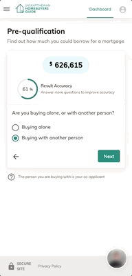
Doubled pre-approval form submission rate
Before changes to improve UX, 5.9% of users completed the pre-approval step (5th image). After, 14.8% submitted the form in one session.
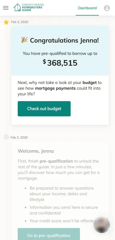
A common frustration users have with the home-buying process is that they aren’t sure what they need to do next. The improvements include always providing a next step, even if things could be done in any order.
✉️
Automated email follow-ups if user has not progressed
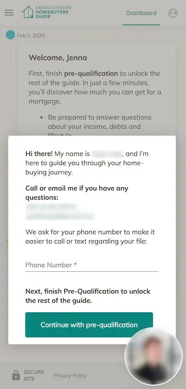
After sign-up, further reduced friction in the core app experience with:
- Guidance and introduction to the real human that would help along the way
- Smooth transitions and visual progress indicators on the stepped pre-qualification flow
- Highlighting the next step and tracking progress on the dashboard
- Automated emails to deal with drop-off between forms (saving manual effort from the mortgage underwriters)
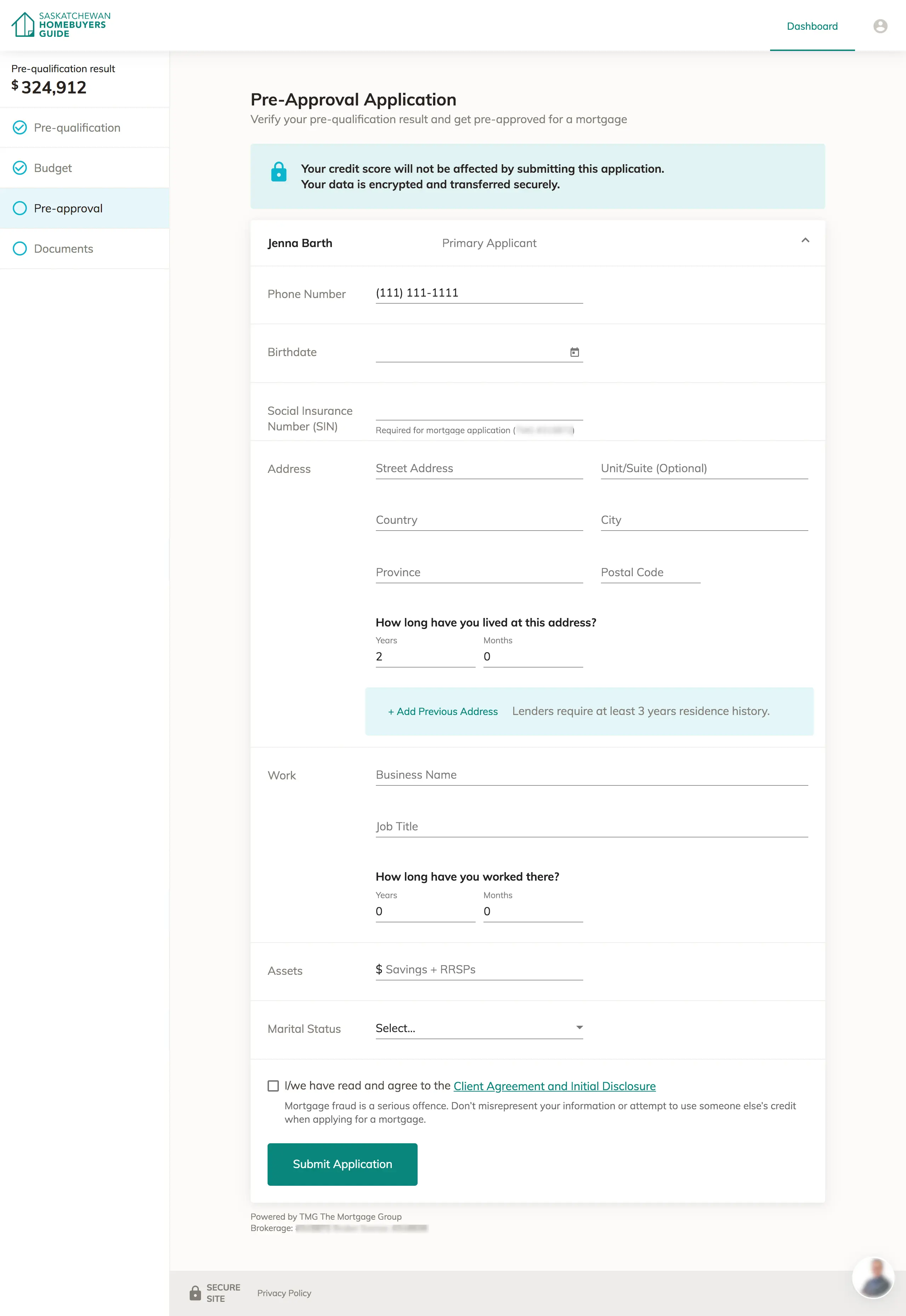
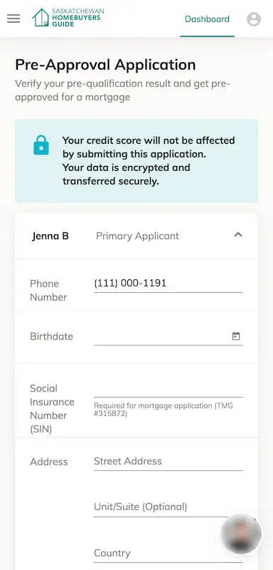
Complex form design
The pre-approval application page is an example of a somewhat complex user input screen that needed to ask for a lot of information, some of which was sensitive or conditional based on answers given previously.
Form layout and style — On larger screens, the form mimics a traditional paper form but with greater whitespace for readability. We used the (now deprecated) Material Design underline-style fields from a 3rd-party code library. This style is more widely known to provide a poor UX now, I think it might work in the paper-like form. An updated design could use conventional bounded web form elements with top labels.
Conditional sections — An option to add extra addresses or jobs appear if the time entered doesn’t meet the requirement.
Longer forms — If a user had previously stated that they have a co-applicant, the whole form is copied into a collapsed section with their name.
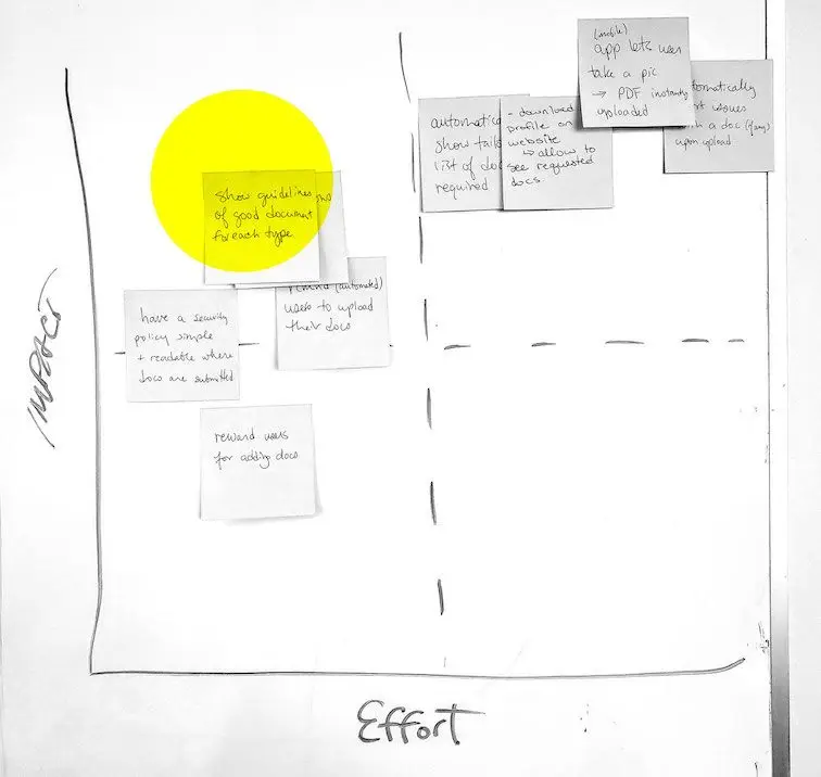
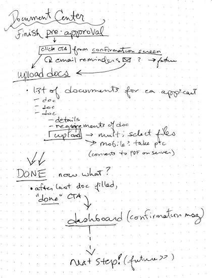
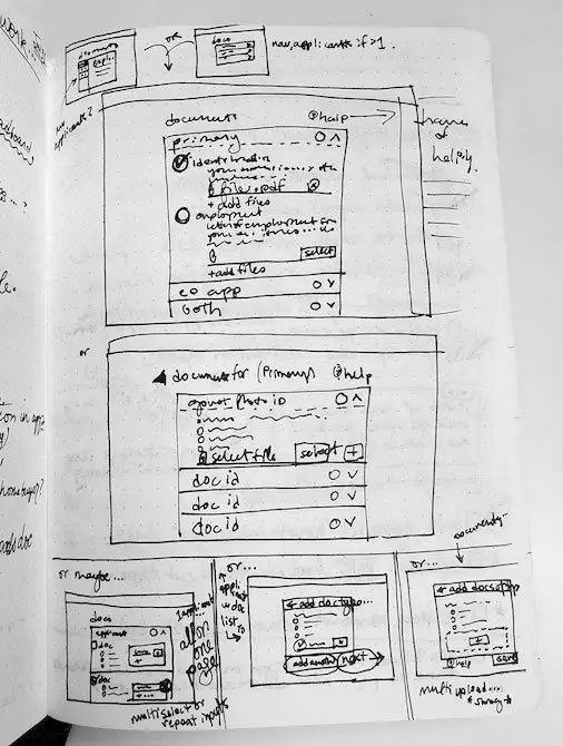
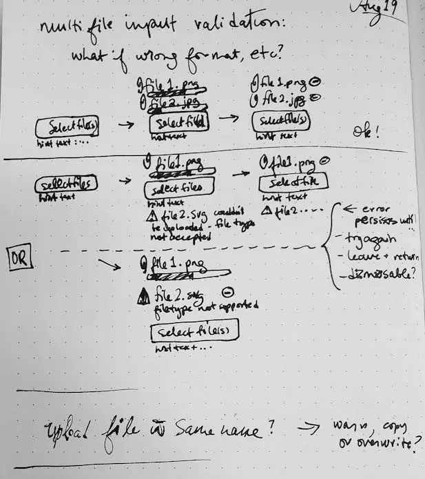
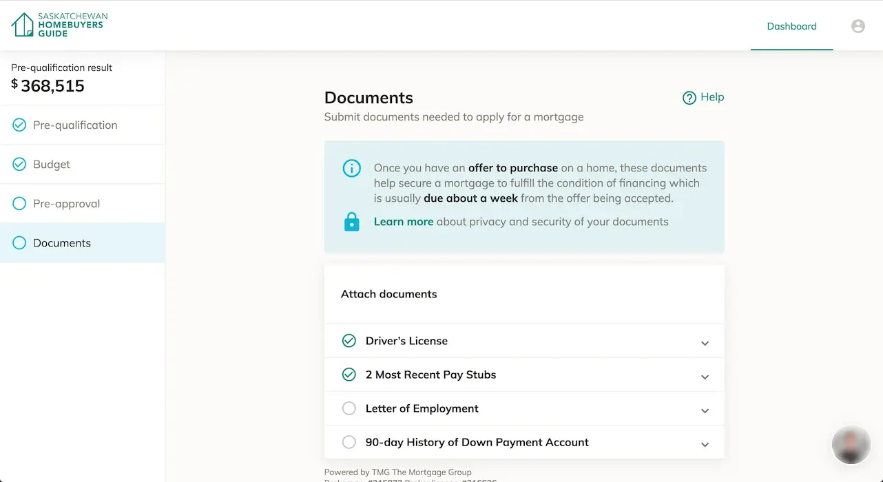
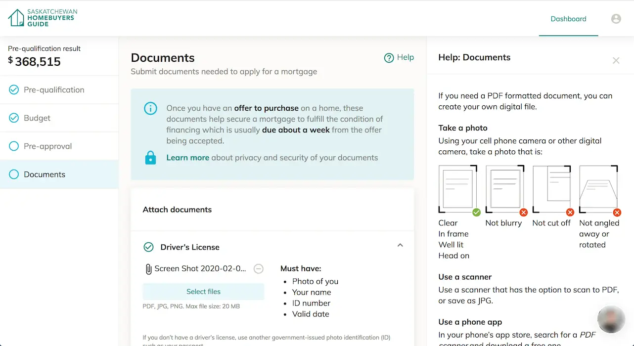
Designing a smooth document submission experience
Lenders need proof of an applicant’s financial situation to give a mortgage, but collecting proof (documents) is a hassle:
- Usually done in person (takes time) or over email (insecure)
- Different documents are needed depending on the unique applicant’s circumstances
- There may be a lot of pages...
- ...and then someone submitted poor quality files and it needs to be redone
Home buyers can feel overwhelmed with all documents involved. The design solution involves showing only the required documents for each buyer’s unique needs, presenting clear instructions for submission, and showing completion progress.
How might we... get the buyer’s documents to the lender in a quicker, secure way?
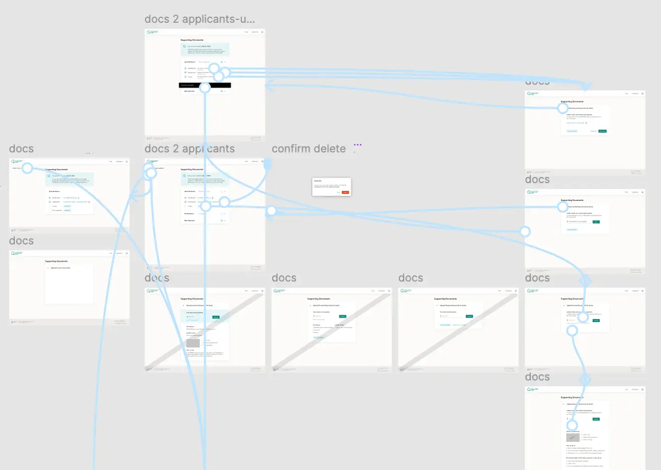
Outcomes — Underwriters reported that the submitted documents were correct and good quality, helping them complete applications sooner.
Recordings from Hotjar confirmed that users were successfully using the document center.
With this feature added, we supported another piece to the home-buying journey.
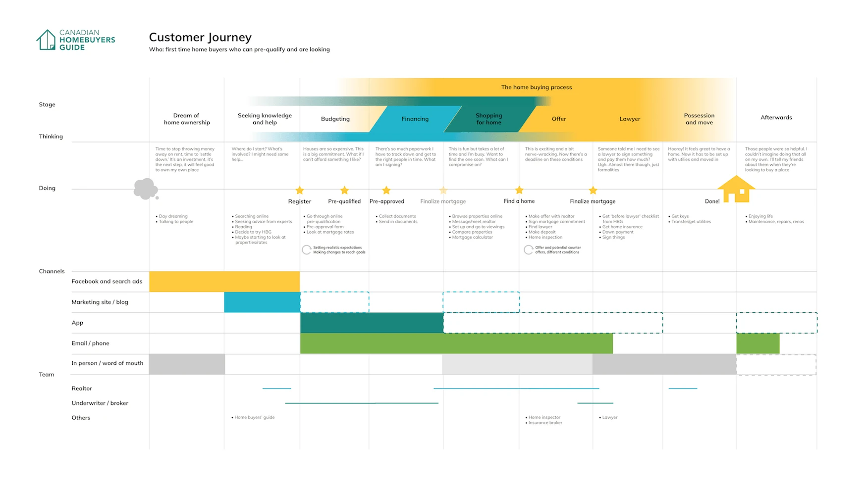
Customer Journey map informed by user and stakeholder interviews. It includes online and offline activities in the user experience. Dash-outlined areas show opportunities to expand. (Originally designed as a printable poster.)
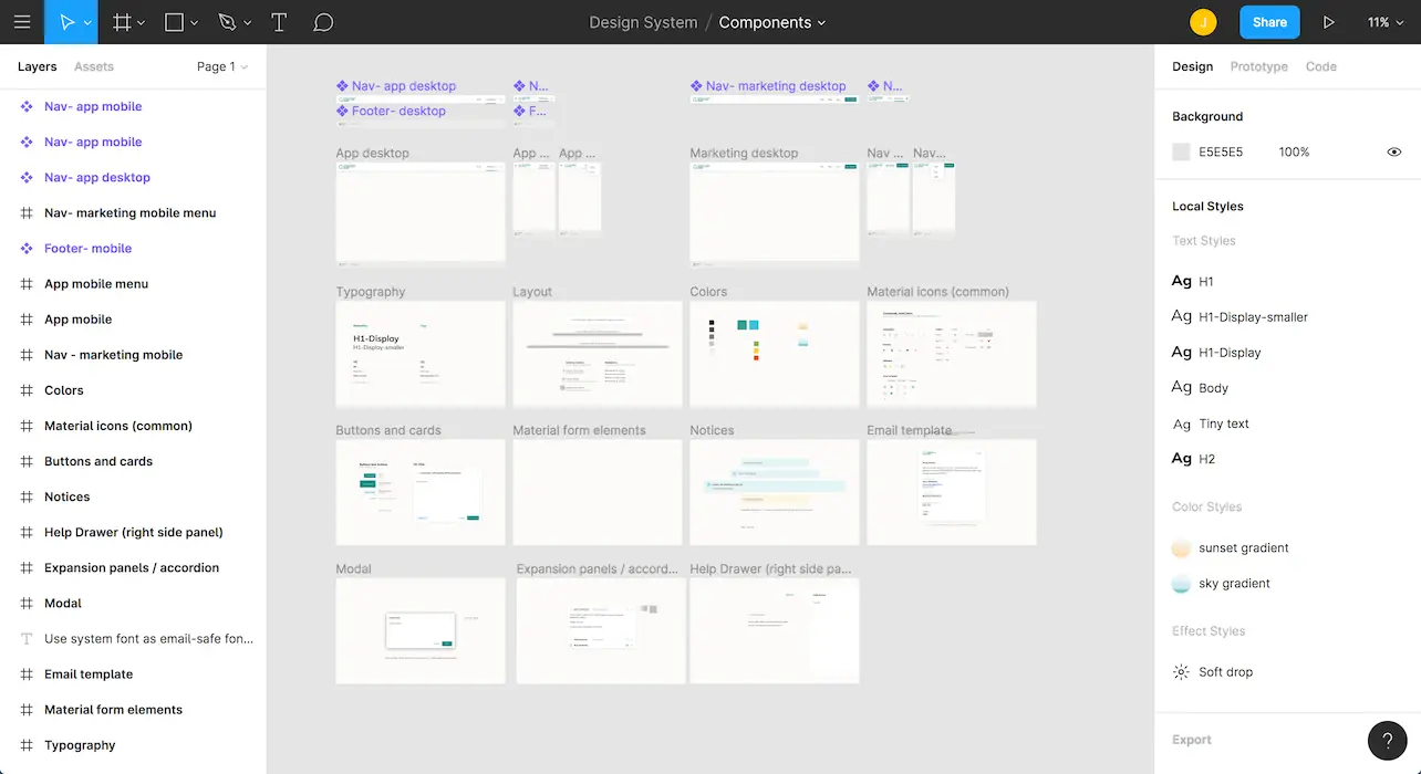
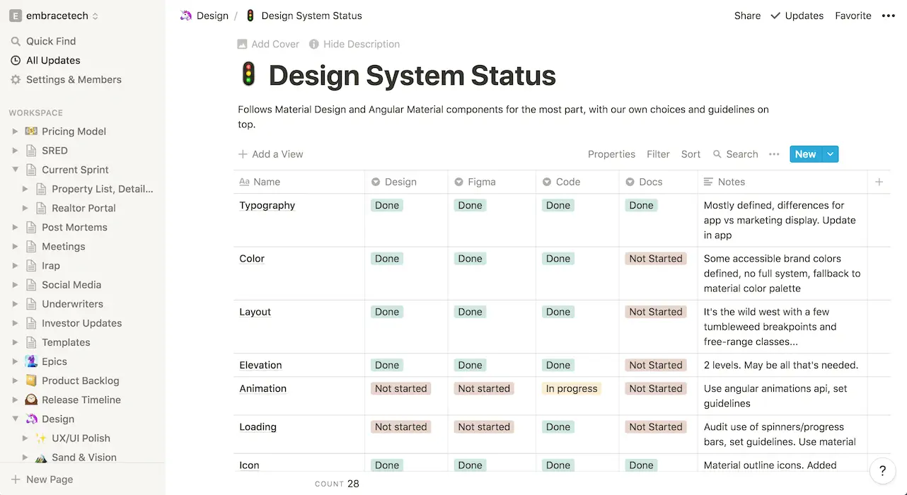
Starting a design system
Starting a design system at the same time as building a product at a busy startup may seem like a time sink, but it saved us work on the very next features.
Instead of designing every possible element, I started with what we were already using, and added more components as the need arose.
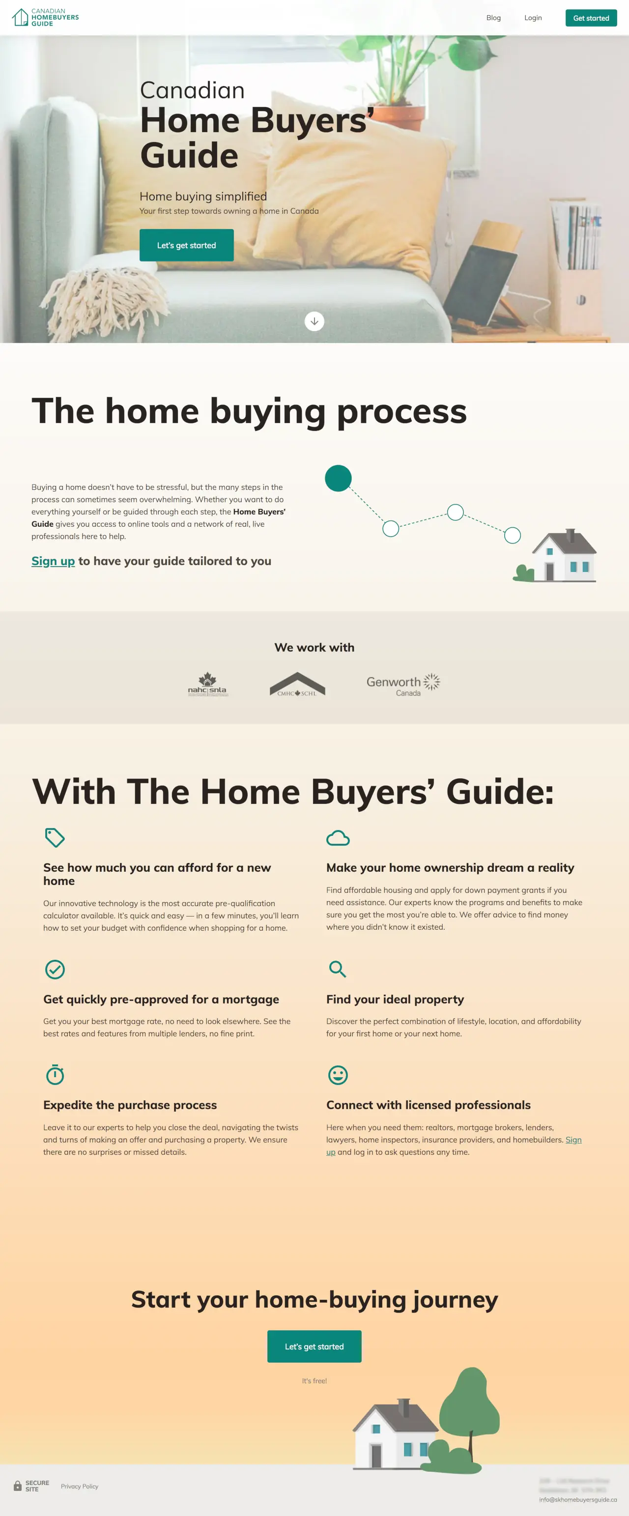
Optimized sign-up
Iterative changes to the existing marketing page and sign-up form design informed the redesign and led to a high-converting version.
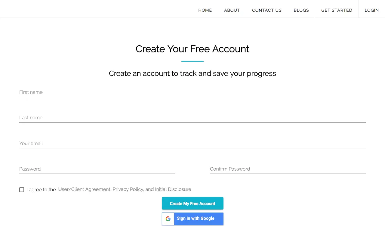
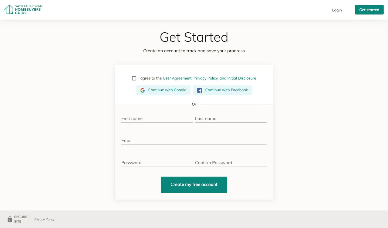
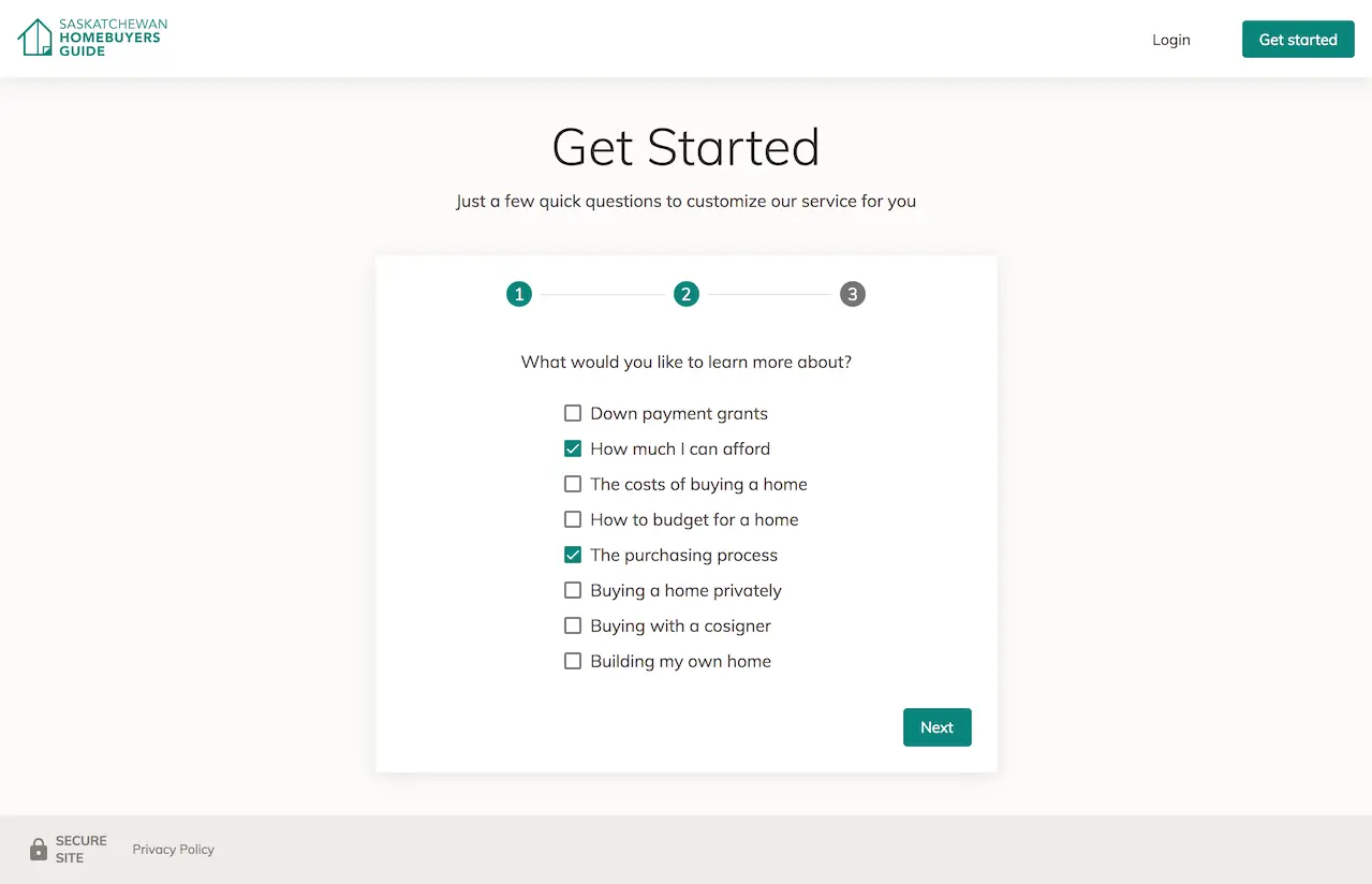
The sign-up flow also included a few personalization questions before asking for the user’s information. The hypothesis is that users will feel more invested and aligned before creating an account. The content of this step was mainly unchanged with the redesign, but surrounding factors could have improved its perception.
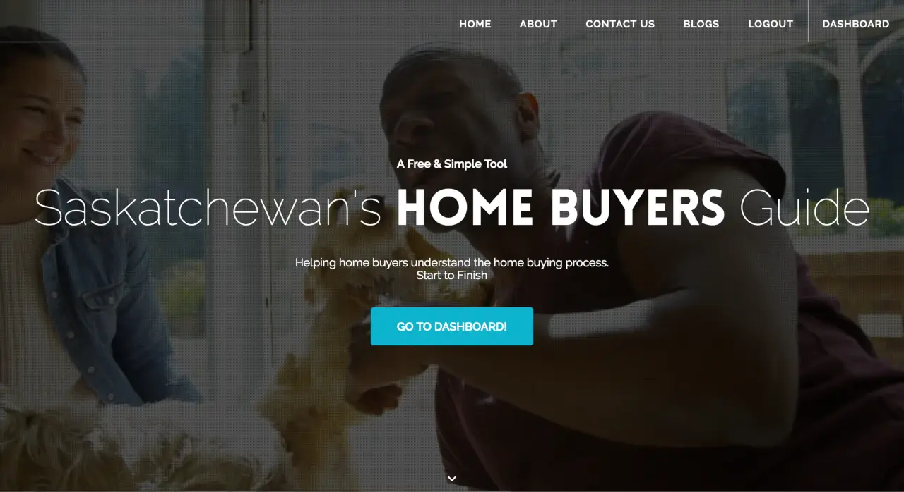
Redesigned, faster marketing home page
As part of a small start-up, I did everything from designing the logo and business cards, to writing copy. Marketing isn’t my main focus, but the process of compiling a persona and researching competitors applies here too, as in product design.
We wanted local provincial versions of the site, but no one wants to do duplicate work, so I implemented a site generator script to quickly deploy provincial versions as business expanded.