Driving design system adoption across 13 apps
- 99% Coverage for “page” component
- 13+ Apps adopting
- 20+ Interns trained on design system
The problem
A growing company with many divergent products. Vendasta’s product portfolio was developed by different agile teams. Previous style guides failed to keep pace with evolving technologies, leaving products looking dated and inconsistent. With a high developer-to-designer ratio, design resources were stretched thin or missing in areas. Most teams lacked sufficient HTML/CSS experience, creating a gap in translation from static designs to the final product.
The solution
The company was a perfect candidate for a design system. A design system would unify the appearance and behavior of disparate apps into a cohesive suite, while closing the frontend implementation gap.
Challenges
Work with a third-party component library
Using Angular Material components initially jump-started development, but led to major snags when the library introduced breaking changes years later. Users also reported confusion from the mix of Material and Galaxy components as we filled in company-specific pieces.
To avoid confusion, one approach would have been to branch off the third-party system, rename components, and maintain only the ones we used—though this could still be challenging due to Angular Material’s tight coupling with the Angular framework.
I would’ve liked to explore a framework-agnostic design system approach. While generic systems are fine for quick MVPs, a custom framework-agnostic system would emphasize a product’s unique differentiators and could simplify the integration of acquired products.
No major redesigns of existing apps
Following Vendasta’s core tenet of iterative development, component adoption was done incrementally alongside new product work, instead of a “big bang” release.
To see visual results quickly, I began by unifying the base styles of color, typography, spacing — small updates that apply to all pages. The team introduced components over time and helped install them. Later, we worked with product teams to develop components during feature work.
Limited design system team resources
I began on a centralized team with a tech lead, frontend engineer, another staff designer / design engineer, and a product manager, most of whom were simultaneously needed on other projects. The team dissolved after about a year due to multiple restructurings and departures.
I shifted us to a federated component contribution model and continued to maintain and advocate for the design system with 20% or less of my time.
High expectations and measuring value
Proving the value of the design system can be difficult. We were pressured to show end-user value before establishing internal adoption metrics, perhaps because the design system project changed divisional ownership a few times.
Design systems are usually an internal investment in efficiency and alignment. The pay-off is in the ability for teams to focus on features that provide user value, instead of fussing over UI details. The customer-facing value is often subtle: the overall effect quality and trust that comes from consistency. Only at a high level of maturity do I think it might be possible to measure a design system’s direct impact on customer success, although, I don’t see anyone talking about it.
Eventually, some internal adoption metrics were agreed upon. Ideally, everyone involved would agree on the desired outcomes up front. I do think the design system was successful, despite all the challenges. By this estimation, the design system might’ve had a 170% return on investment over 5 years. We eventually started hearing more positive qualitative feedback from customers about the UI/UX of new releases too.
What I did
Design system adoption

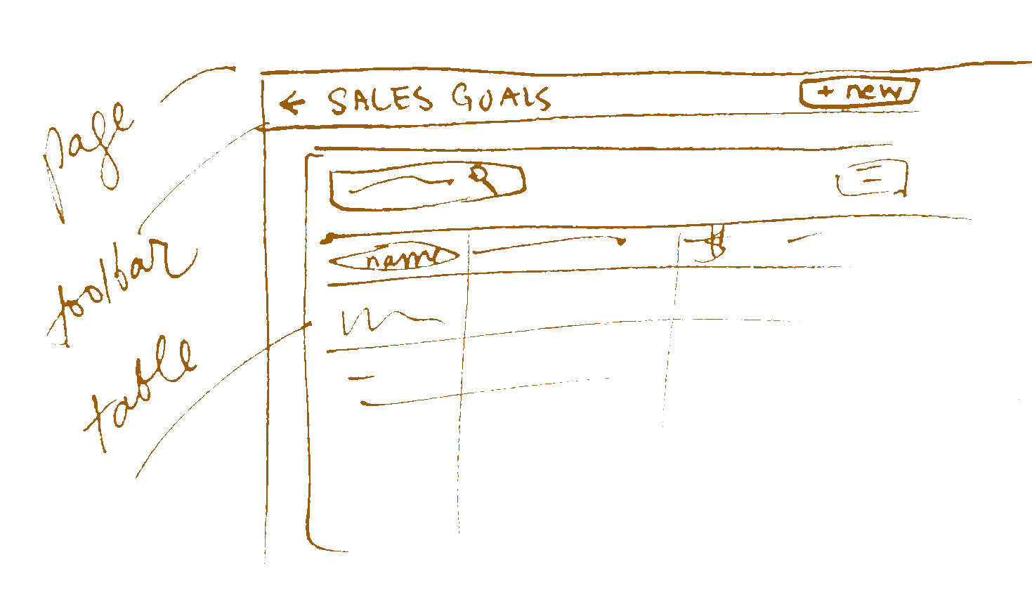
99% adoption of at least the Page Toolbar component across hundreds of pages and 13+ apps.
To move this line, I...
- gave presentations on the use of Page and Layout components,
- set a guideline to update old pages when working on them,
- reviewed code for component use,
- and did a few conversions when there was time.
Success story: feature creation without design resources
When a temporary development team needed to solve problems for an enterprise client, they were able to create a live, testable feature using only Galaxy components (page, layout, table, form fields, confirmation modals).
Design system engagement
Vendasta had a few hundred employees in R&D, including about 20 in design. I reached out to find representatives from each part of the product design and development organization, and regularly hosted round table discussions and occasionally structured feedback sessions on the design system.
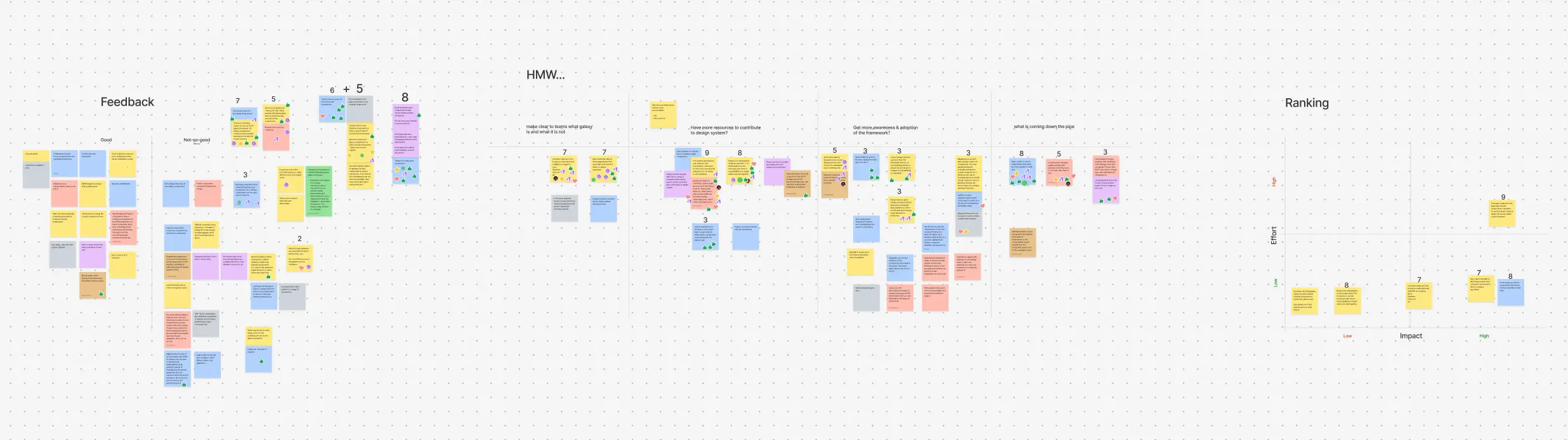
We took in the good and bad feedback, grouped and voted on top problems, reframed the problems as “How might we” questions to brainstorm solutions, then ranked proposed solutions on an impact vs effort scale.
What’s good about the design system?
Designers said...
“Hands down absolutely love working with the Galaxy components and states/variants in figma with auto-layout, it is a huge time saver.”
“Consistency is a breeze with the galaxy system components - being able to point developers to the corresponding item online really helps”

“Dark mode woaaaaaaaaa!!”
Developers said...
“When I do use a component it’s easy to use & fit in”
“glxy-page + glxy-nav was a great upgrade”
“Shared styles make styling consistent across the platform”
“Nice to have consistent design elements to work with”
Some examples of critical feedback we addressed
“Takes time to migrate some components”
→ Created migration plans and offered assistance
“Unclear what components are coming down the pipe”
→ Opened up team kanban board, posted previews in internal channels
“Examples are a bit confusing”
→ Updated some examples to be less exhaustive and more realistic
Key learnings
Communication is one of the biggest hurdles to design system success. Designers and developers need to talk to each other. The design system meeting made space for them to hear each others’ feedback, confirming that both must be involved in the final product delivery for the best outcomes.
 Communication is one of the biggest hurdles to design system success. Designers and developers need to talk to each other. The design system meeting made space for them to hear each others’ feedback, confirming that both must be involved in the final product delivery for the best outcomes.
The design system team itself must over-communicate, as people frequently miss things. We posted previews and updates in multiple channels (Slack, internal newsletter, internal demos) and found the need to reiterate demos over time.
Frontend skills are still important in adopting teams. I initially thought design systems would negate the need for developers to know HTML/CSS. However, coding with UI components still requires knowledge of web standards, especially when the system is growing and being integrated incrementally.
While trying to meet users where they are through component features and documentation, I also prioritized education (teaching CSS basics, presenting component demos, offering mentorship) to ensure at least one person on every team had strong HTML/CSS expertise.
A tool to visualize design system adoption
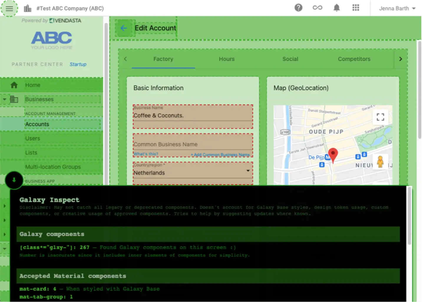
The Galaxy Inspect Chrome extension in use.
- Highlights components on the page without breaking layout
- Collapsible panel with more information
It was hard to show stakeholders that work was being done to update the UI. Feedback would often ask “is that using Galaxy?”
I made this tool during a hackathon, inspired by other design systems that have created similar tools. I gave it to internal users interested in the progress of UI conversion, without needing to dig into the code to see what changed, when some UI looks very similar otherwise.
For people working on old UI, it gives advice on how to update components.
Design system onboarding exercise for new hires
Developer interns go through a week long training camp. I created a one-day workshop to introduce interns to the design system, using common components and completing routine UI tasks.
Using a Figma prototype, component documentation, and a code sandbox, interns go through 3-5 phases starting with a simple layout to a complex one with some custom elements. Along the way I presented concepts and helped with questions in a classroom setting.
- ~20 developer interns completed the workshop in two years’ cohorts
- They had some fun customizing their pages
- Interns took design system knowledge back to their home teams
- Graduates added material and assisted me with the next year’s workshop
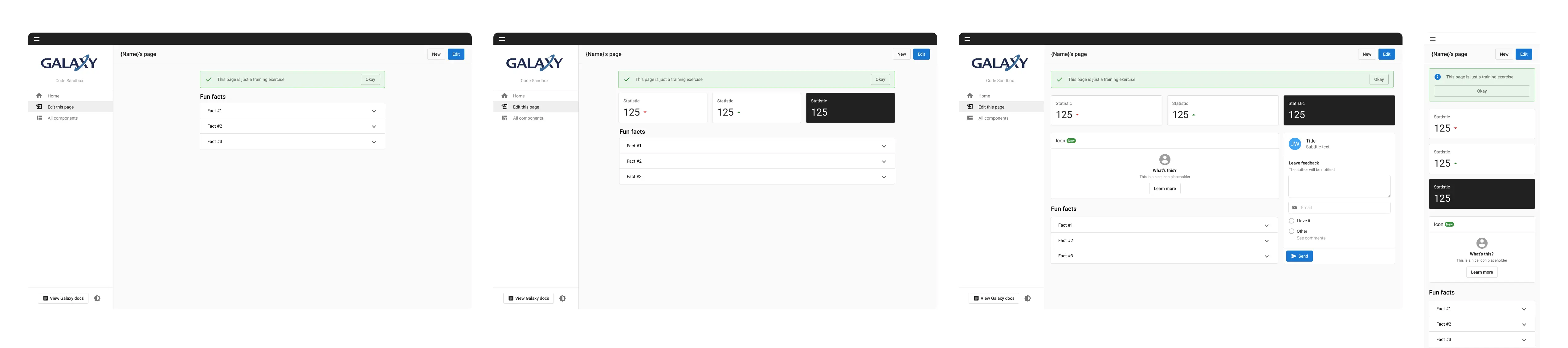
The workshop starts with a simple layout and evolves into a more complex page with some custom elements.
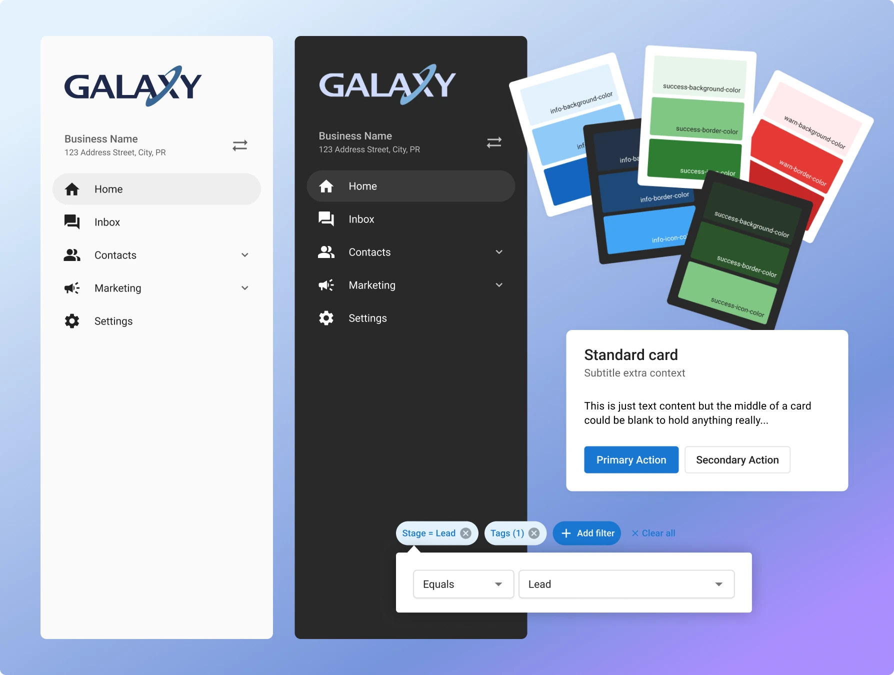
Introducing dark mode
Dark mode was a popular request, but seen as “nice to have” and likely too much effort to apply to so much legacy code with mixed frontend frameworks.
Prove it can work
CSS custom properties (aka variables) were an emerging standard. I figured they could allow us to easily implement themes. Most apps were already using SASS variables for colors, we could change them to point to CSS variables to power theming.
With a bit of research, I discovered other design systems were already using CSS variables for theming in a similar way, which helped validate the idea.
I translated the existing light theme to dark while maintaining good contrast and balance, and created a proof-of-concept during an internal company hackathon.
Make it easy to use
Theming requires no extra design or development work to function once enabled. New color themes could be added easily by defining another palette. We could even allow resellers to further customize their themes in the future.
I implemented dark mode in the Galaxy documentation site and the Advertising Intelligence product, then made a conversion guide and project tracker for others.
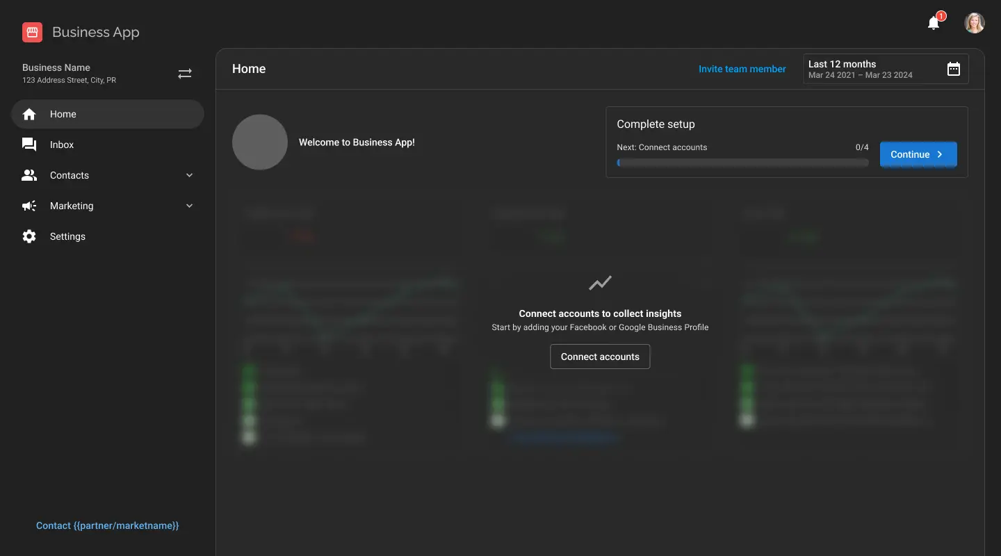
Using the documentation, a product team converted Business App for dark mode.
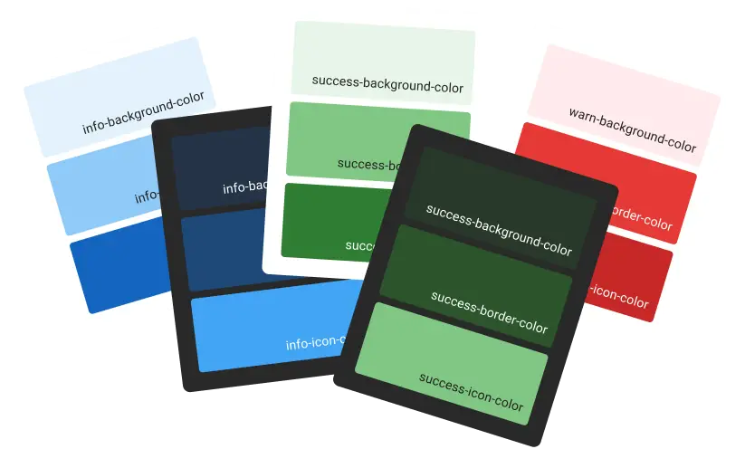
Colors are kept in sync using design token management between Figma, code, and documentation.
Customers and internal users were delighted by the launch of dark mode. It’s seen as an accessibility win and is almost an expected feature of modern software.
Redesigned filter components
Background
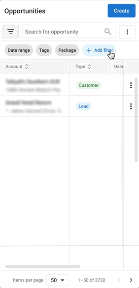
Users would export tables again and again to complete their data tasks, like sales reporting and list building.
We wanted to offer more granular filtering in the product so users wouldn’t have to leave to complete their work. The existing filter UI didn’t scale for many options.
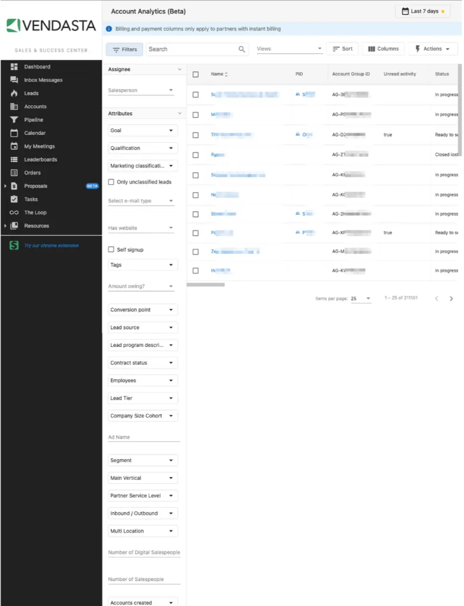
I took an audit of the existing filter UI and found inconsistent design patterns. Most tables had around seven filters. The product vision would require scaling for many filters, but also had to support existing uses. Filters were also found on feeds and grid layouts.
We would need a filter design that was scalable for a table with a few or many filterable items, that would grow with the CRM data. Oh, and it should work on mobile too.
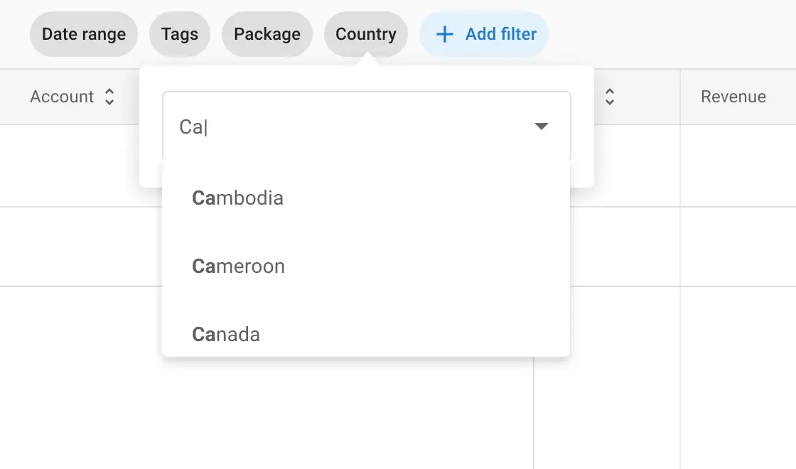
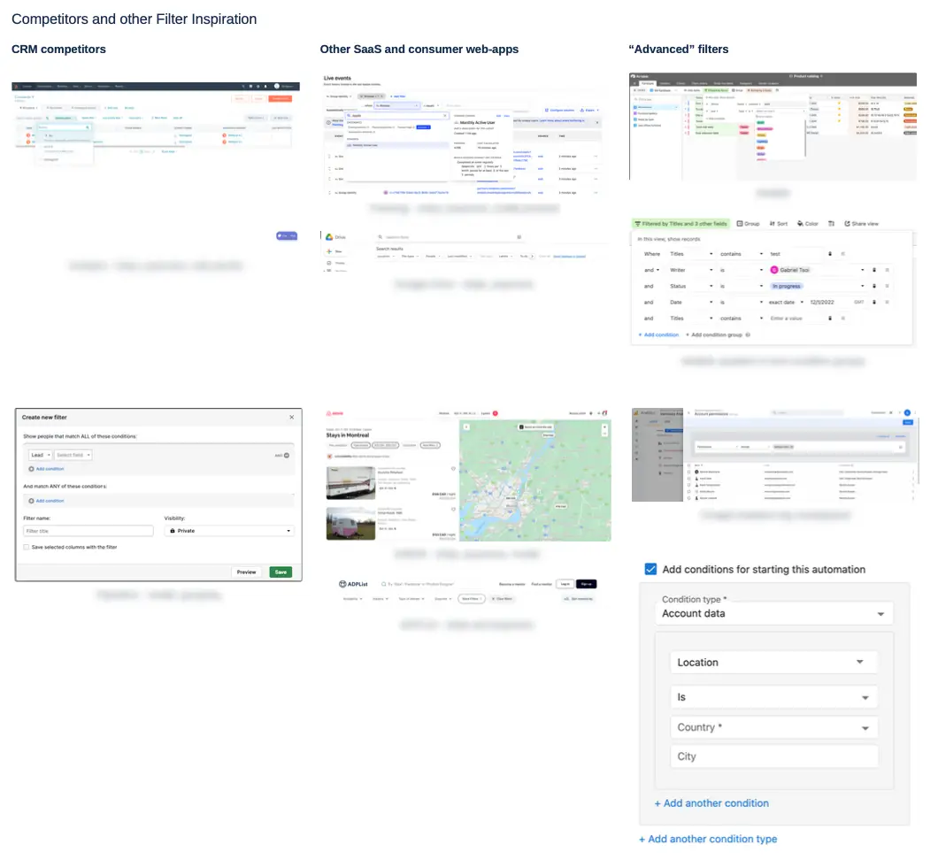
I took a sample of filter patterns in comparable software, generic data tables, and some consumer apps. The scalable pattern of “filter chips” emerged. I applied this idea to existing filters and showed how it could fit in a mobile context (see below). As a future possibility, I also prototyped an “advanced” filter builder (with “and/or” logic and grouping) that could be created by re-using components from the filter chips.
During the filters project, I worked with the development team that would be implementing filters in the new CRM, involving them in the design process and incorporating technical feedback.
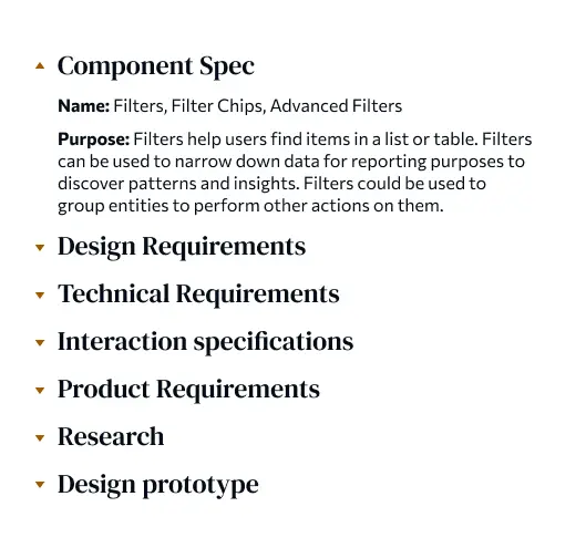
The component specification was created in collaboration with the PM and senior developers, to consider requirements from all angles.
New filters experience
Users found the filters to be a smoother experience — it’s easier to find a filter in the searchable list than the super long column.
However, it doesn’t make sense to search for a filter when there’s only a few available. I recommended adding preset filter chips so the “Add” step can be skipped. Presets also guide users to the most common filtering tasks.
It’s also annoying to rebuild long complex filters every time they’re needed. “Views” were introduced to save applied filters as shortcuts.